Google Developers Group

July 7, 2025

Évora, Portugal

01.
Introduction
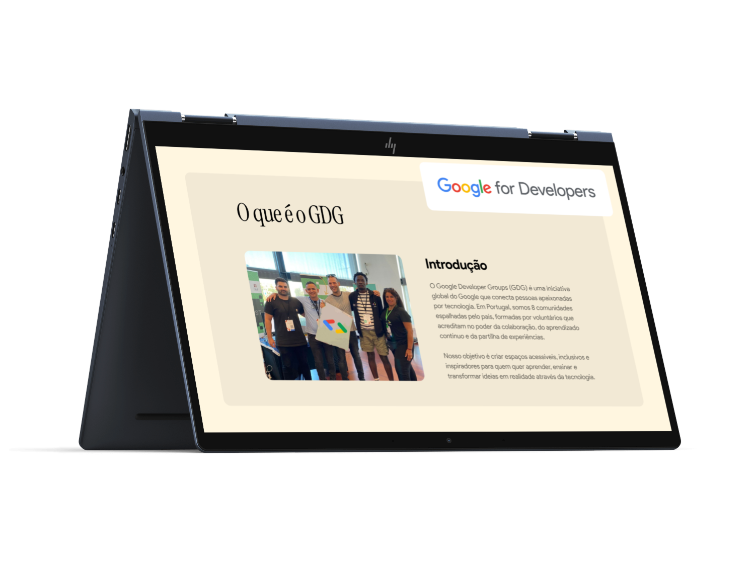
Google Developer Group (GDG) Portugal is a community-led initiative that connects developers, designers, and tech enthusiasts through events, talks, and workshops.
The goal of this project was to redesign the GDG Portugal website to improve clarity, accessibility, and community engagement, while aligning with Google’s design principles.
The existing website presented several challenges:
- Information about events and chapters was hard to find
- The navigation lacked a clear hierarchy for new visitors
- The visual design felt inconsistent with Google’s brand system
- There was no strong call-to-action for joining the community
As a result, first-time visitors struggled to understand what GDG Portugal is, how to participate and where to find upcoming events.
02.
Goals
Increase event participation, strengthen the GDG Portugal identity and encourage community sign-ups and newsletter subscriptions.
Also, the user goals was to quickly understand what GDG Portugal offers, easily discover upcoming events, access resources and past talks and join the community with minimal friction.
The target audience are developers (frontend, backend, mobile, AI), designers interested in Google technologies, students and early-career professionals and tech community members in Portugal.
03.
Discovery & Research
The discovery phase focused on understanding how Google Developer Groups present themselves digitally and how event-driven tech communities communicate value, credibility, and belonging through web design.
To ground the design decisions, I analyzed official GDG chapter websites such as GDG Évora and GDG Lisbon, as well as the global GDG platform. This helped establish a baseline for content structure, tone of voice, and alignment with Google’s ecosystem.
The discovery phase focused on understanding how Google Developer Groups present themselves digitally and how event-driven tech communities communicate value, credibility, and belonging through web design.
In parallel, I explored event-focused websites and templates including DevFest Lagos, Eventverse, InnovateXpo, and Keynote. These platforms were particularly useful for understanding how large-scale tech events prioritize information, guide users toward action, and create excitement through visual hierarchy and motion. Unlike community platforms, these sites are optimized for conversion, with strong emphasis on schedules, speakers, and registration flows. Studying them highlighted patterns that could be adapted to GDG Portugal without losing the community-driven nature of the project.
I also reviewed Google’s own community and developer pages on developers.google.com to better understand how Google communicates programs, learning opportunities, and stories. These pages reinforced the importance of clarity, accessibility, and modular layouts that scale across different audiences and content types.
Across all benchmarks, special attention was given to navigation structures, homepage storytelling, event visibility, call-to-action placement, and how trust is built through visual consistency and content transparency. This comparative analysis allowed me to identify where existing GDG chapter websites were strong, where they felt fragmented, and where there was room to evolve the experience into something more engaging and contemporary.
04.
Key Insights
One of the strongest insights from the research was that users arrive at GDG websites with a clear intent: they want to know what’s happening next.
Event information consistently takes precedence over organizational history, and websites that surface upcoming events immediately feel more useful and relevant. Platforms like DevFest Lagos and Eventverse demonstrate how prioritizing dates, locations, and topics early in the experience reduces friction and increases engagement.
Another key insight was the importance of balancing global brand consistency with local identity. While gdg.community.dev provides a solid and trustworthy foundation, local chapter websites often lack personality and emotional connection. Event-focused templates such as InnovateXpo and Keynote show how strong visual language, motion, and layout can create excitement and reflect the energy of a community, even before the user reads any content. This highlighted an opportunity to give GDG Portugal a more expressive visual presence while still respecting Google’s design system.
The research also revealed that many GDG chapter websites struggle with hierarchy and storytelling. Information is often technically correct but poorly structured, making it harder for first-time visitors to understand what GDG is, who it’s for, and how to get involved. In contrast, Google’s official community pages excel at progressive disclosure, introducing concepts step by step and guiding users toward action with confidence.
Finally, accessibility and clarity emerged as non-negotiable foundations. The most effective examples rely on simple layouts, strong contrast, and predictable interaction patterns rather than complex visuals. This reinforced the idea that the design should feel welcoming and inclusive, especially for students and early-career developers, without sacrificing polish or credibility.
These insights directly informed the design direction, shaping a website that leads with events, communicates community value quickly, and combines Google’s clarity with the energy and warmth of an active developer community.
05.
Design Solution
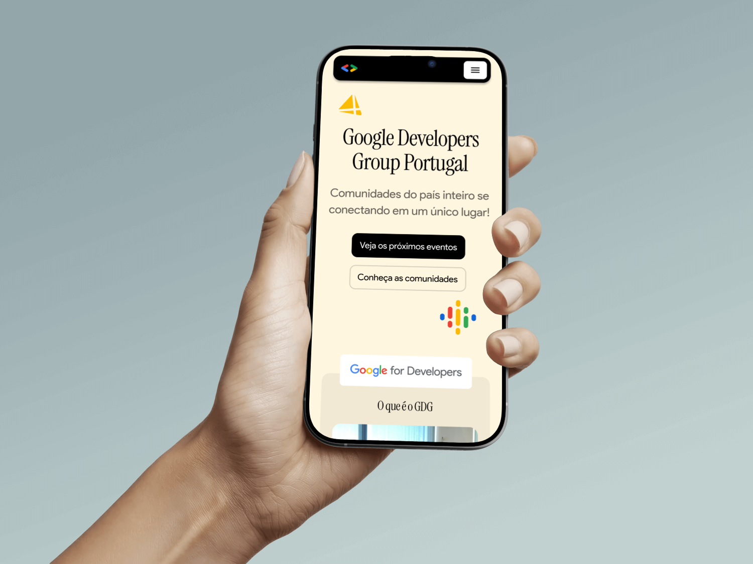
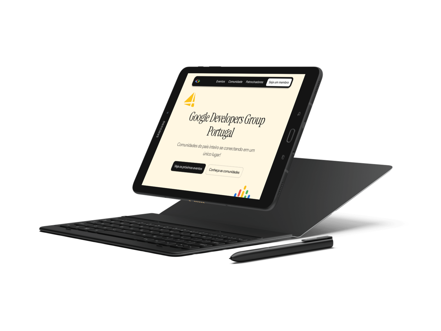
The final design translates research insights into a clear, event-first experience that reflects both the global Google Developer Groups identity and the local energy of the Portuguese tech community. The solution focuses on clarity, engagement, and scalability.
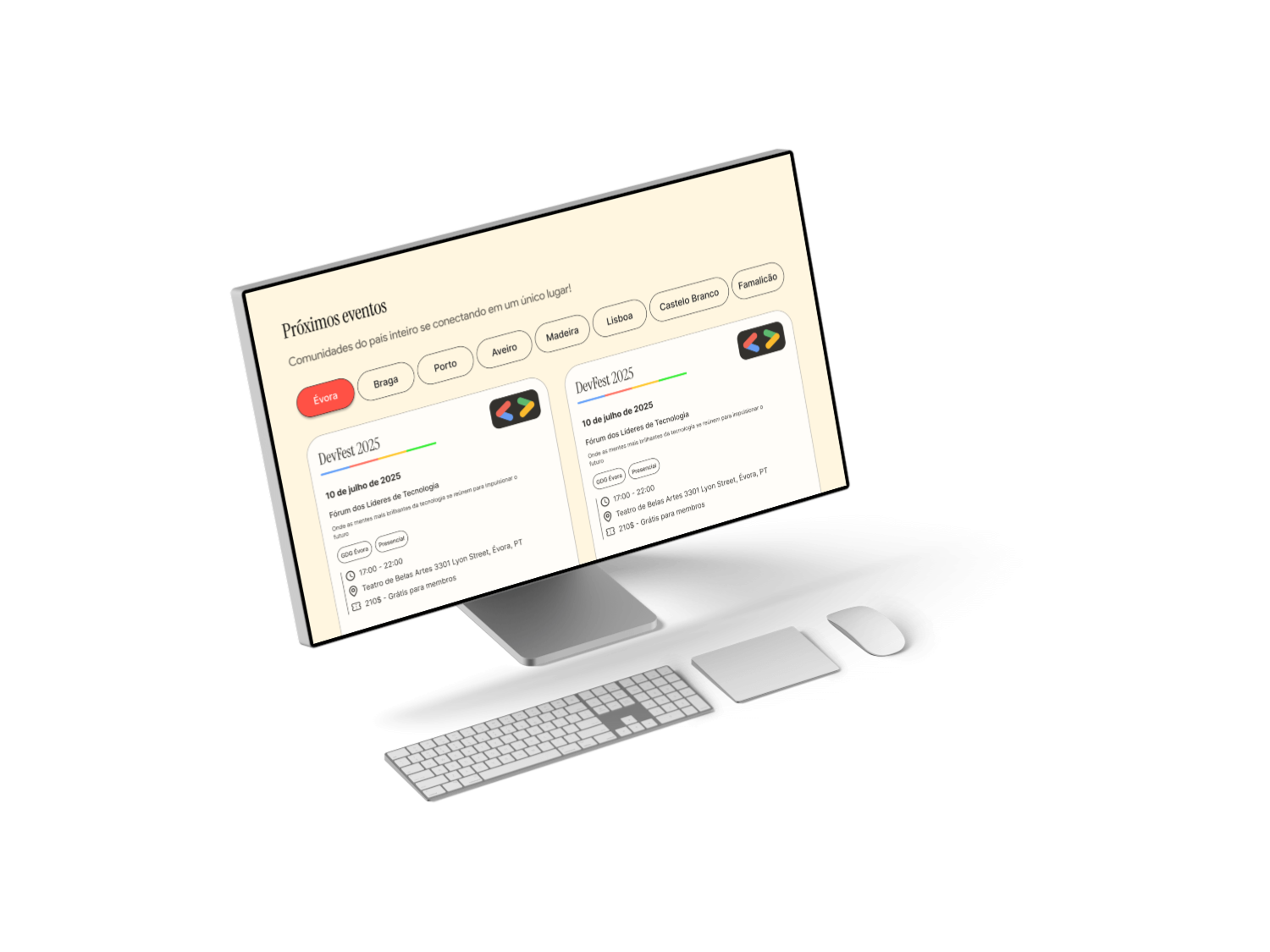
Event-First Experience
The website is designed to immediately answer the user’s primary question: what’s happening next and how can I join?
- Upcoming events highlighted above the fold, ensuring immediate relevance
- Clear event cards displaying date, location, topic, and call to action
- Reduced friction for first-time visitors looking to attend their first GDG event
This approach was inspired by high-performing event platforms while remaining true to GDG’s community-driven purpose.
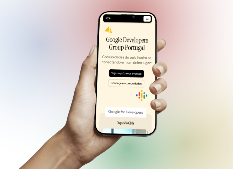
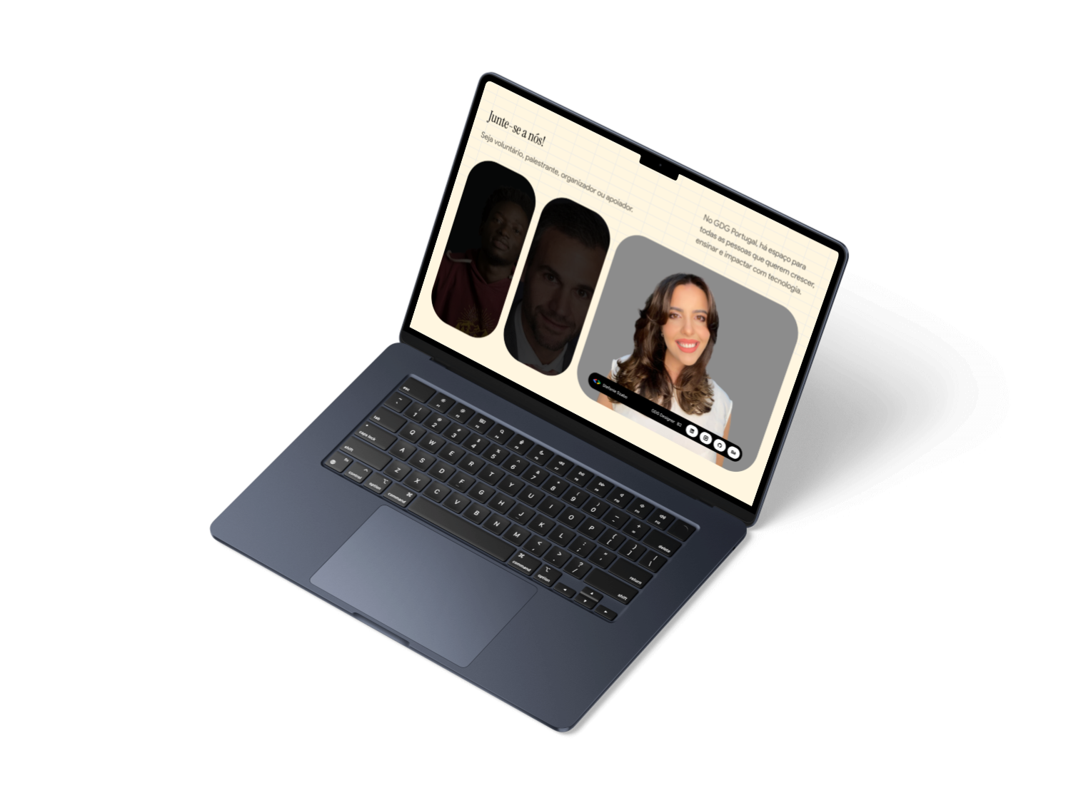
Homepage as a Dynamic Entry Point
Instead of acting as a static introduction, the homepage functions as a live snapshot of the community.
- A concise value proposition explains what GDG Portugal is and who it’s for
- Strong but non-intrusive CTAs such as join the community and Attend the next event
- Visual hierarchy guides users naturally from awareness to action
This structure supports both new visitors and returning members without overwhelming either group.
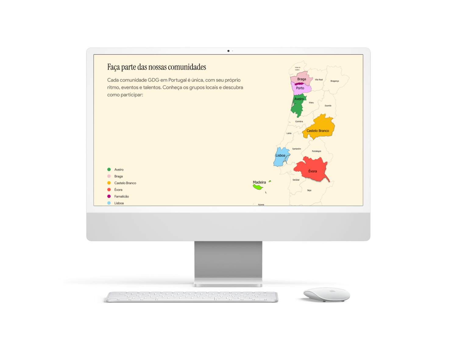
Simplified Navigation & Information Architecture
Navigation was redesigned around user intent, not organizational structure.
- Clear separation between Events, Community, and Resources
- Fewer top-level navigation items to reduce cognitive load
- Content organized to support fast scanning and decision-making
This mirrors successful patterns seen in event-focused websites while maintaining openness and inclusivity.
Visual Language & Brand Alignment
The visual system is rooted in Google’s Material Design principles, enhanced with expressive elements drawn from modern event design.
- Restrained color palette and strong typography for clarity and trust
- Generous spacing and modular layouts for readability
- Expressive typographic moments and subtle motion to convey energy
The result balances brand consistency with a more human, engaging tone.
Modular & Scalable System
The design system was built to evolve with the community.
- Reusable components for event cards, content sections, and highlights
- Flexible layouts that support future chapters, programs, and initiatives
- Easy content updates without requiring structural redesign
This ensures long-term sustainability and adaptability.
Accessibility by Default
Accessibility considerations were integrated throughout the design process.
- High color contrast and legible typography
- Clear visual hierarchy and predictable interaction patterns
- Responsive layouts optimized for mobile and desktop
This makes the experience welcoming for a broad audience, from students to experienced professionals.
05.
Final Remarks
This project demonstrates how thoughtful web design can strengthen a community by making participation clearer, more inviting, and more accessible. Rather than focusing solely on visual refresh, the redesign repositions the GDG Portugal website as an active touchpoint for connection, learning, and engagement.
By combining insights from existing GDG chapters, Google’s own community platforms, and high-performing event websites, the final solution bridges the gap between structure and emotion. It respects the credibility of the Google brand while amplifying the human side of developer communities: curiosity, collaboration, and shared growth.
The result is a flexible foundation that supports current needs and future expansion, enabling GDG Portugal to communicate more effectively, reach new audiences, and continue building a vibrant and inclusive tech ecosystem.
Next Steps:
- Integrate event APIs (Meetup / Eventbrite)
- Add a blog or knowledge hub
- Localize content for broader accessibility
- Continuous iteration based on community feedback