
Map Me Out

August 12, 2025

São Paulo, Brazil

01.
Introduction
Map Me Out is a platform designed to empower travelers, digital nomads, and explorers by combining navigation, itinerary planning, and community-driven discovery.
Unlike traditional mapping tools, the vision was to create a product that blends functional travel planning with social connection, helping users not only get from point A to B but also discover meaningful experiences along the way.
A platform designed to empower travelers, digital nomads, and explorers by combining navigation, itinerary planning, and community-driven discovery. Unlike traditional mapping tools, the vision was to create a product that blends functional travel planning with social connection, helping users not only get from point A to B but also discover meaningful experiences along the way.
02.
UX Process
The design process followed a human-centered approach:
Research & Insights
Interviews with digital nomads, solo travelers, and frequent flyers revealed frustrations with fragmented tools.
Pain points: juggling multiple apps for maps, itineraries, and meetups; lack of personalization; difficulty in connecting with like-minded travelers.
Personas & Journey Mapping
Personas included “The Remote Worker Nomad,” “The Solo Explorer,” and “The Organized Planner.”
Journey maps highlighted moments of stress (flight changes, finding local meetups) and opportunities for delight (discovering hidden spots, connecting with communities).
Prototyping & Testing
Low-fidelity wireframes tested navigation flows.
Iterations focused on reducing friction: fewer taps to access itineraries, contextual recommendations, and simplified community features.
03.
Benchmarking and strategic direction
To define Map Me Out’s positioning, we benchmarked against both nomad community hubs and travel planning apps:
Nomad & Community Platforms
- Nomads.com / Freaking Nomads: Strong in fostering global digital nomad communities, but limited in integrated travel planning.
- Nomadtable: Focused on social meetups for solo travelers, but lacks robust itinerary or mapping features.
Solo Travel Meetup Apps: Great for connection, but fragmented when it comes to logistics.
Travel Planning & Itinerary Apps
- TripIt: Excellent for consolidating flight and trip details, but weak on social/community aspects.
- AXUS Travel App: Professional-grade itinerary management, but geared toward agencies rather than individual explorers.
- Passporter: Strong in collaborative trip planning, but less personalized for nomads.
- Wanderlog: Free and flexible planner, but lacks deeper integration with nomad lifestyle needs.
Wanderlust App: Inspires discovery and tracking, but more aspirational than practical.
Strategic Direction for Map Me Out
- Differentiation: Combine the community-driven strengths of nomad hubs with the functional rigor of itinerary apps.
- Opportunity: Position as the bridge between logistics (maps, itineraries, offline navigation) and lifestyle (community, meetups, local discovery).
- Long-term vision: AI-driven personalization (routes, meetups, recommendations) and partnerships with local businesses/events to enrich the nomad experience.
04.
UX Design
Designing Map Me Out was not just about building a tool, but about creating an experience that feels intuitive, informative, and welcoming.
This section explores how the app was structured, how its wireframes evolved, and the principles behind its visual design.
Architecture
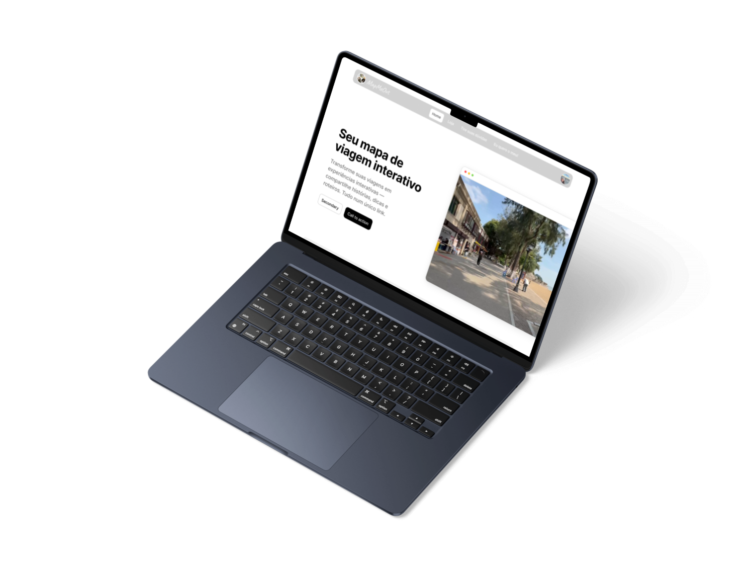
The foundation of Map Me Out begins with a clear entry point: the landing page. This is where new users can learn about the app, understand its purpose, and decide to join the community. Once logged in, the experience opens up into a world map — a dynamic visualization showing everyone currently connected.
From there, navigation flows naturally:
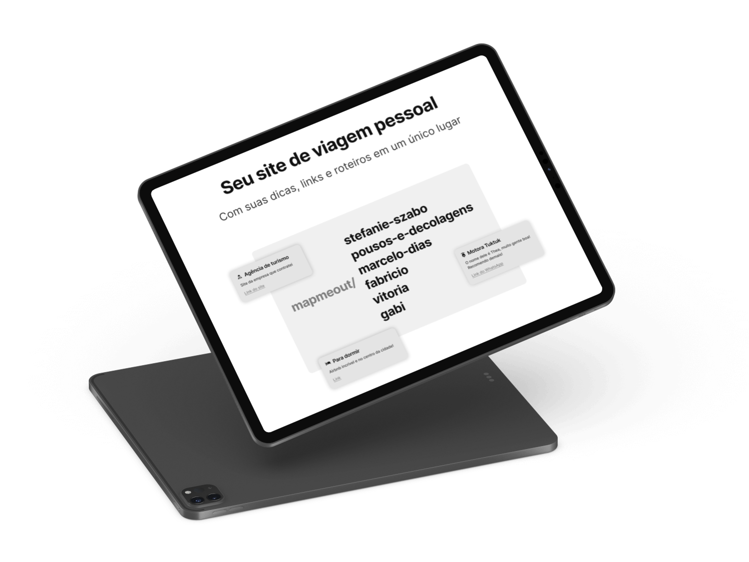
- My Map: A personalized space where users can track their own journeys.
- World → Countries → Cities: A layered structure that lets users zoom in from global to local.
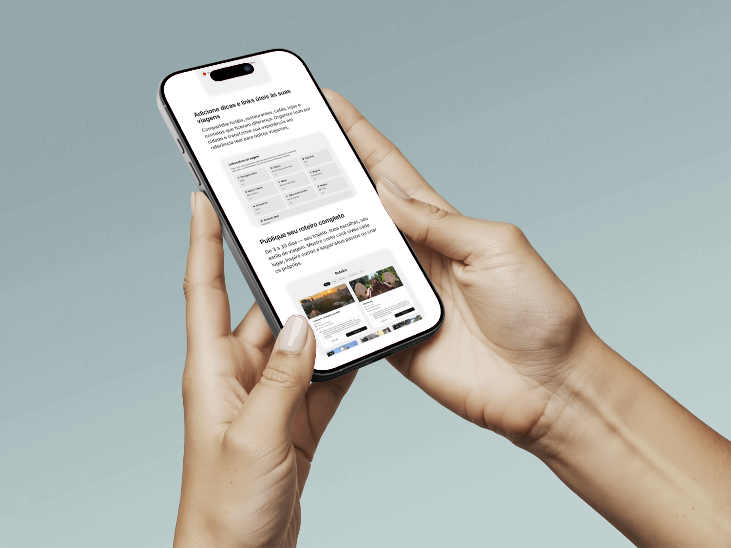
- Reviews & Links: Each city or location contains reviews, insights, and links to resources, creating a rich ecosystem of information.
This architecture ensures that users can move seamlessly between personal exploration and global discovery, while always feeling connected to the wider community.
In the future, the open page itself will be the full interactive world map
Instead of starting with a static landing page, users will immediately see a living, breathing visualization of everyone currently connected. This map will allow people to:
- Search for other users anywhere in the world.
- View friends’ maps and follow their journeys.
- Discover communities dynamically, with real-time updates of who is exploring which city or country.
This evolution transforms Map Me Out from a navigation tool into a social atlas — a place where geography meets community, and where exploration is both personal and collective.
Wireframes
The design journey started with low-fidelity sketches on paper. These early drafts focused on flow rather than detail, helping the team visualize how users would move through the app.
Next came mockups in Figma, where ideas were refined into structured layouts. Here, navigation bars, map interactions, and content blocks began to take shape.
Finally, the project moved into high-fidelity wireframes, incorporating imagery, typography, and color schemes. These prototypes were close to the final product and guided the transition into website production, ensuring that the vision translated smoothly into a working platform.
Visual Design
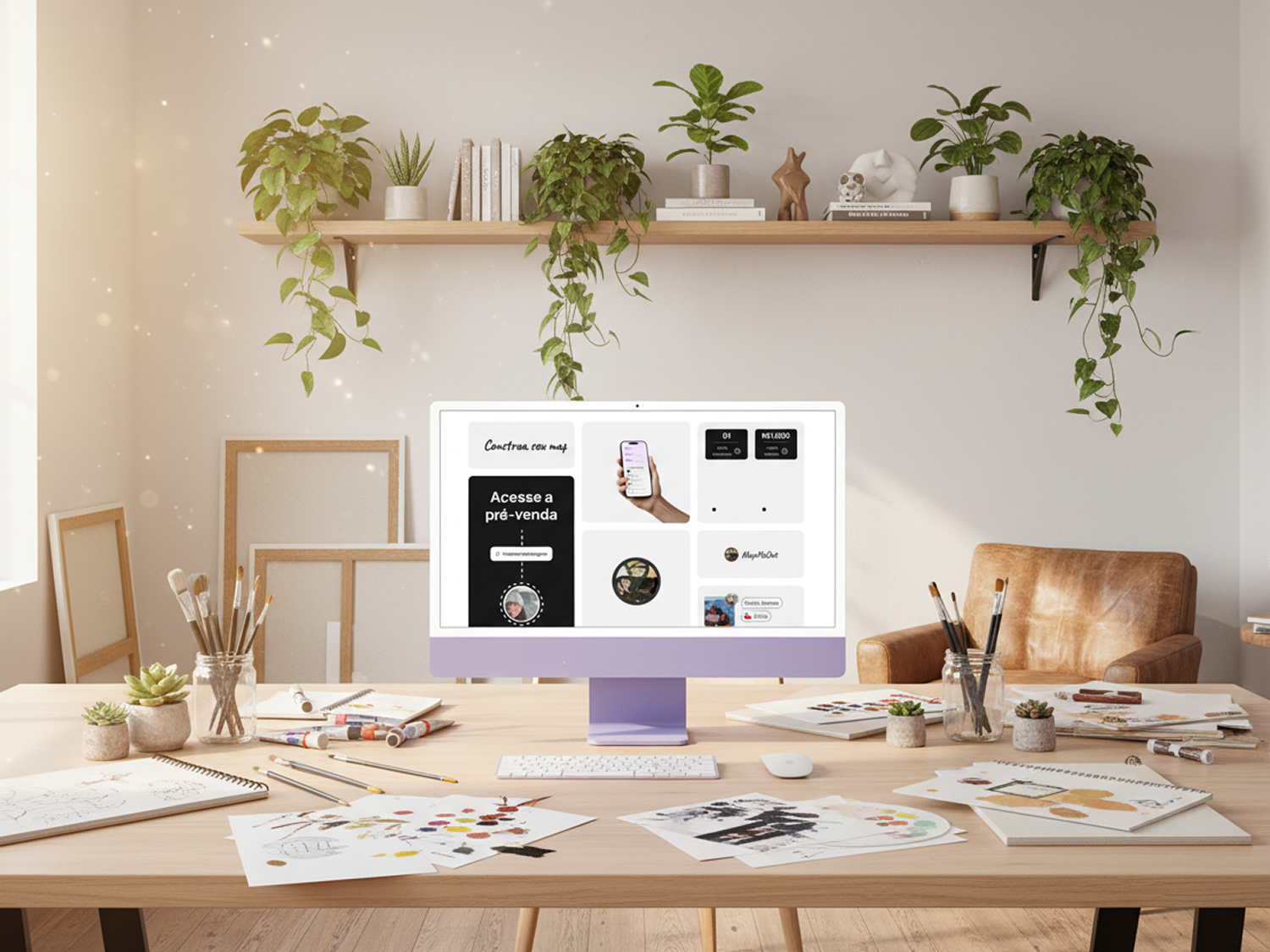
The visual identity of Map Me Out was inspired by platforms like bento.me — clear, modern, and information-rich without overwhelming the user.
Key design principles:
- Clarity: Every element serves a purpose, with no unnecessary clutter.
- Ease of Use: Navigation is intuitive, with consistent patterns across pages.
- Balance: Even with a lot of information available (maps, reviews, links, community data), the design avoids fatigue by using whitespace, clean typography, and calming colors.
The result is a platform that feels both professional and approachable, inviting users to explore without hesitation.
Closing Thoughts
By combining a thoughtful architecture, a structured wireframing process, and a clear visual design philosophy, Map Me Out delivers more than just a navigation tool. It becomes a community-driven space where exploration feels simple, engaging, and rewarding.
05.
Final Remarks
Map Me Out carved out a unique niche by blending navigation, planning, and community into one cohesive experience. Benchmarking revealed that while competitors excelled in either logistics or social connection, none fully integrated both. By prioritizing simplicity, personalization, and scalability, Map Me Out positioned itself as the go-to platform for digital nomads and travelers seeking both clarity in planning and connection in experience.
The case study highlights the importance of grounding design decisions in user research, benchmarking strategically, and maintaining a balance between functionality and aesthetics.
Future directions:
- Expand personalization with AI-driven recommendations.
- Enhance community features (reviews, shared routes).